2025
Leveraging design systems to create a responsive e-commerce experience.
Overview
This comprehensive redesign of Bill's Beer Garden uses familiar e-commerce design patterns and revamped branding to create a simplified, responsive browsing and shopping experience. Our team utilized Figma variables and components to create a flexible and scalable design system.
location_pin
work
group
3 UX Designers
event
Jan - Mar 2025
CONTEXT

Project Goal
Current Bill's Beer Garden Website
article
Text heavy information and undifferentiated menu items decrease legibility.
Walls of text and a lack of visual break up makes it difficult for users to scan info on Bill's and their menu.
device_hub
To find crucial information, users must navigate to Instagram and BeerMenu, discouraging users to stay on the site.
device_hub
Menu styling is different across break points and high contrast visuals decrease legibility.
shopping_bag
Broken shop feature hurts brand recognition and auxiliary business.
Bill's does distribute merch, it is done in person, minimizing brand scope and preventing patron clarity on inventory.
We also wanted to consider context unique to BIll's Beer Garden as a business to better optimize our design to meet their needs:
local_bar
Restriction of alcohol sales online
chair
Open seating model only (No reservations)
calendar_today
Seasonality of hours and menu items
DESIGN SYSTEM
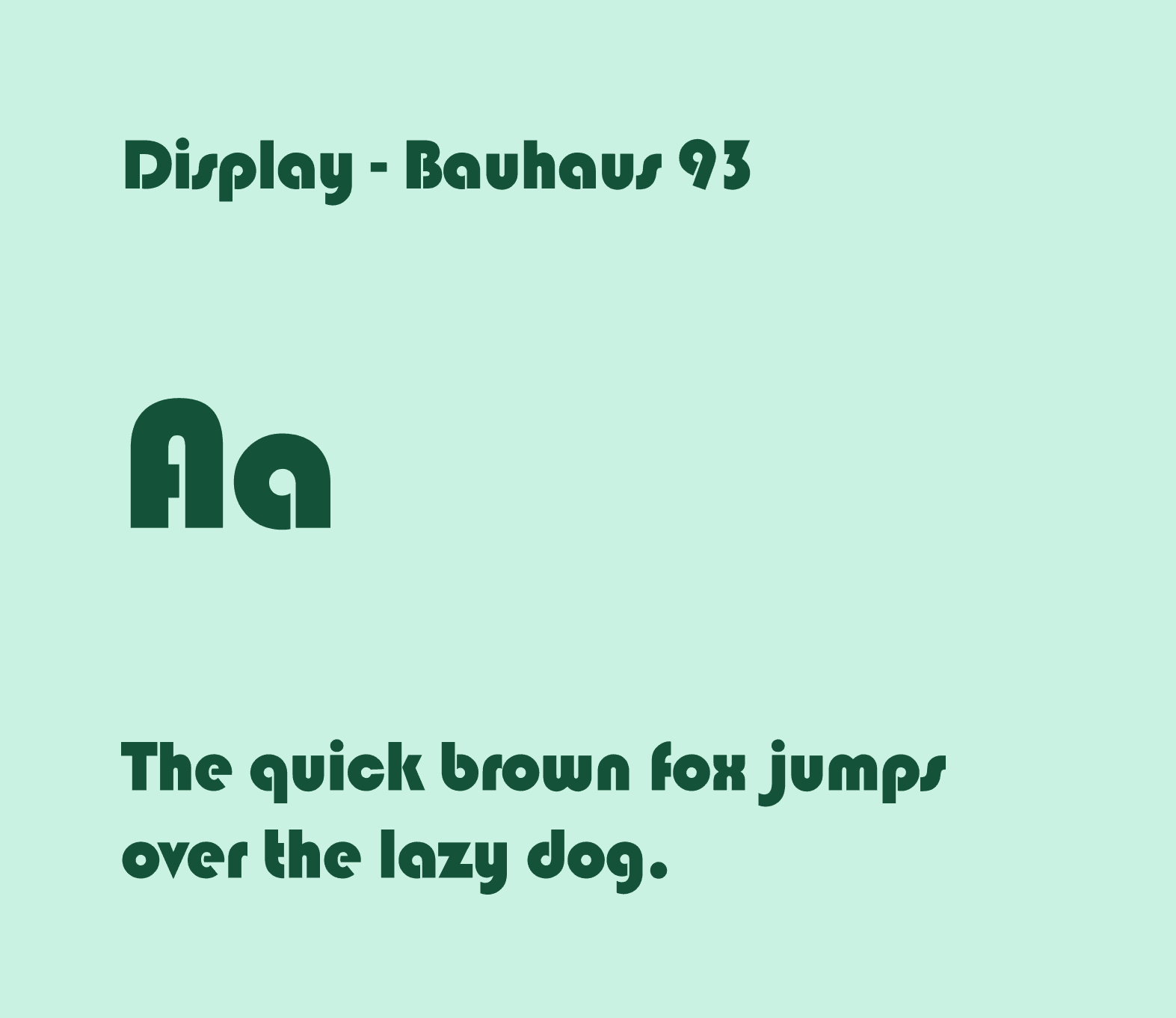
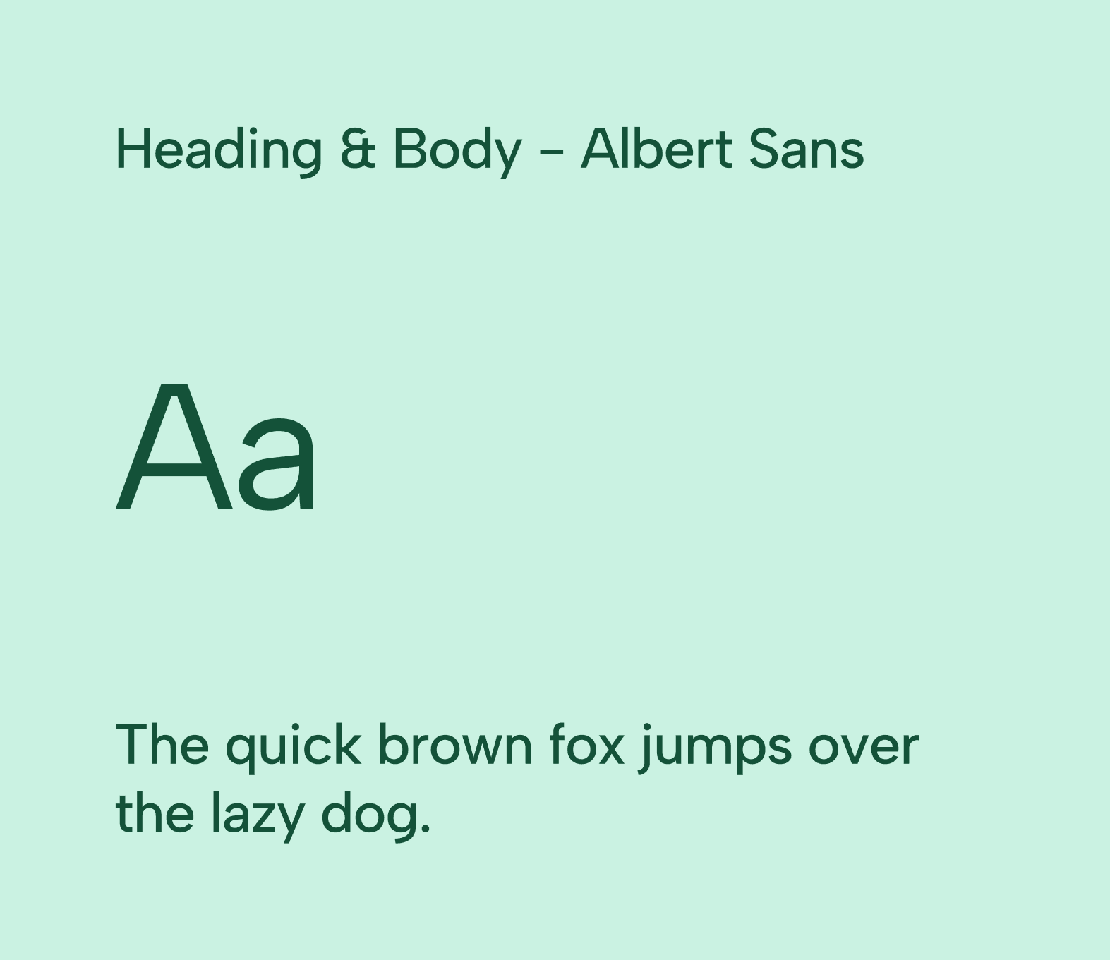
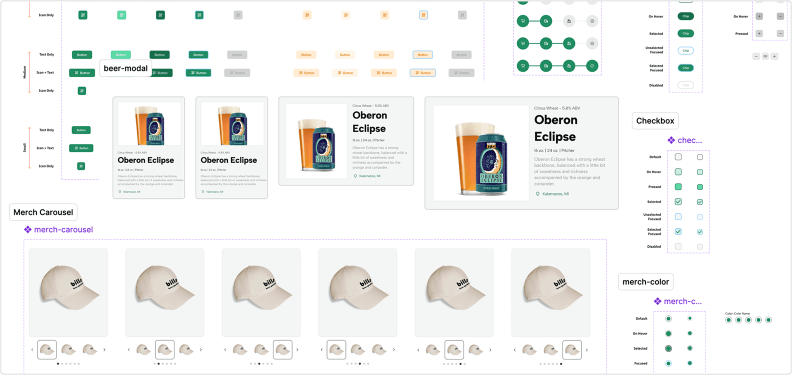
We crafted our design system by focusing on color and typography first. We used Figma variable modes to create responsive sizing for text. Taking an atomic design system approach we then constructed components in the form of molecules, organism, and finally templates and full-scale pages.


DESIGN
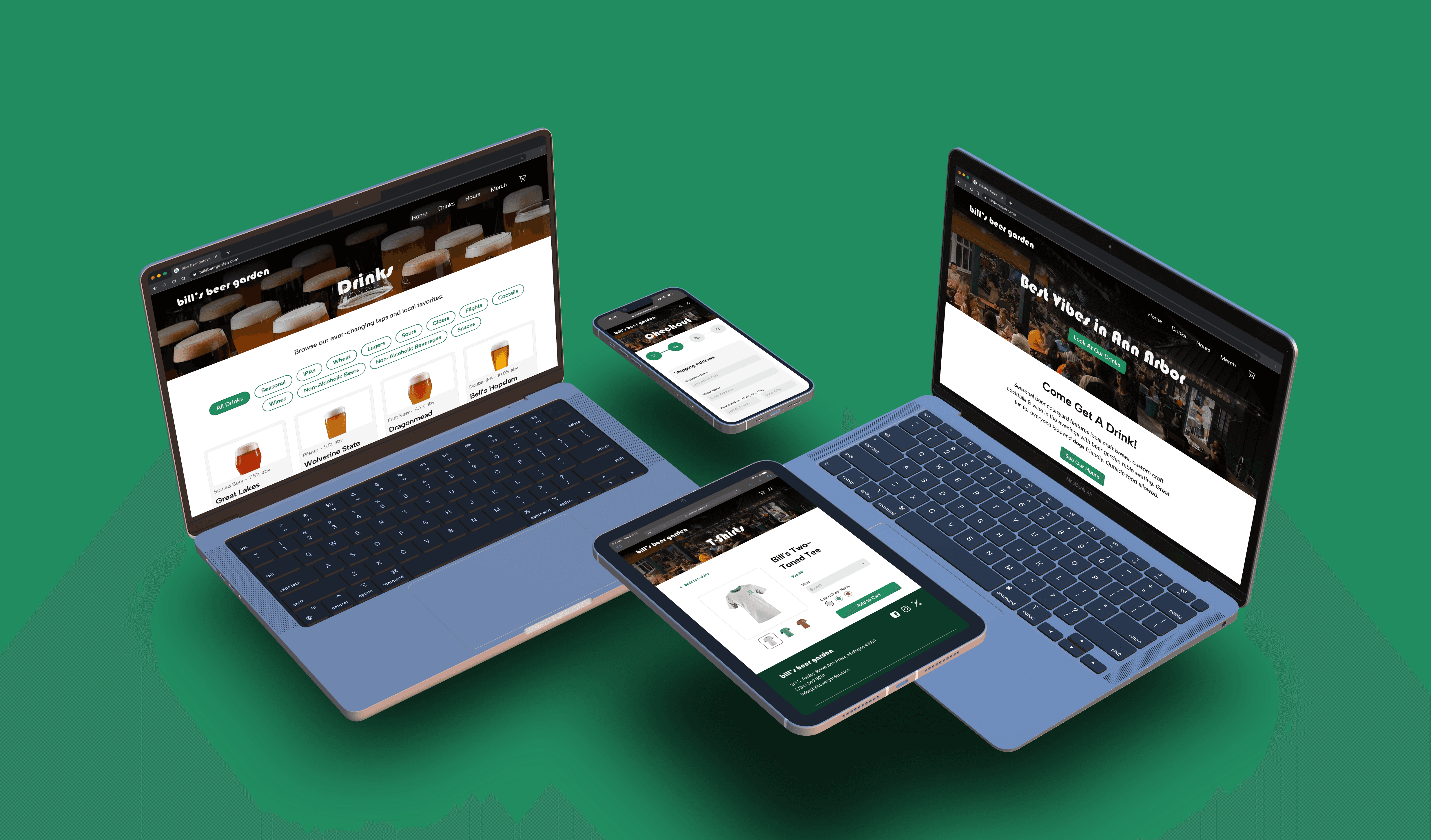
By leveraging Figma variable modes, we were able to create a seamlessly responsive e-commerce experience for 3 breakpoints (1) Mobile (2) Tablet, and (3) Desktop. We also leverage color variables to create light and dark modes for improved accessibility.


Our team several changes to the site. Most notably, we improved the visuals across all flows and improved visual consistency.
Beer Menu Flow
filter_alt
Horizontal beer filter chips to reduce scroll effort.
image
Added menu visuals to increase beer salience.
local_bar
Pop up beer module to decrease clutter.
Merchandise Checkout Flow
image
Improved and customizable merch visuals and categories.
style
Flexible affordances that toggle merch style and size.
shopping_cart
Simplified online checkout process.

Hours Static Page
rainy
Highlighted banner for weather updates
alarm
Simplified hours page for scanability.
REFLECTION

This project taught me how to effectively use Figma variables to create scalable and responsive design systems. I learned the importance of how to properly set up color and type variables, and leveraging responsive modes.
I also honed my UX design skills, considering unique business needs, such as when it is (and when is not) it s appropriate to allow users to purchase alcohol digitally, and how to expand merchandising.
NEXT PROJECT
